Responsive Design with CSS
I have been trying to get better at making my websites/web apps responsive and so this week I looked into doing so with pure css and once I got it it became pretty easy so I’d like to share with you what I’ve learned.
Let's talk about the @media rule in css…
(taken from w3schools.com)
The @media rule is used in media queries to apply different styles for different media types/devices.
Media queries can be used to check many things, such as:
- width and height of the viewport
- width and height of the device
- orientation (is the tablet/phone in landscape or portrait mode?)
- resolution
Using media queries are a popular technique for delivering a tailored style sheet (responsive web design) to desktops, laptops, tablets, and mobile phones.
There are a lot of options with @media but we will focus on screen since we want the screen to appear differently at different screen sizes(break points).
So let's say we have a navbar and it's all styled like so

which is great on a laptop or large screen but when we are on a smaller screen we want it to adjust like this

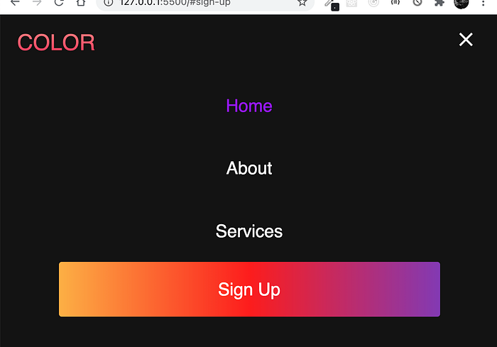
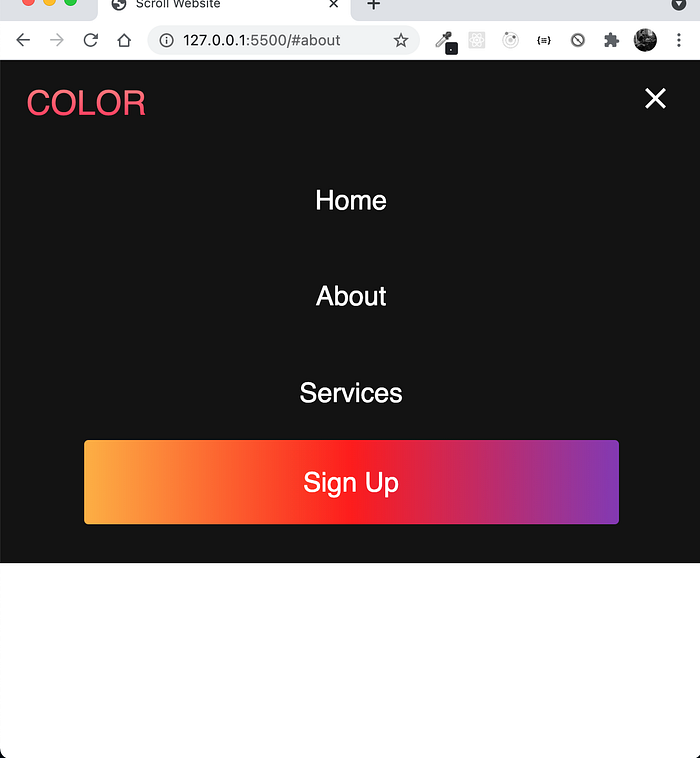
and we click the bars to have a drop down menu now

so to achieve this we will use @media screen then we need to decide at what breakpoint this happens. Typically for mobile view max-width: 960px is fine you can go lower but this will insure that all cell phones(even the big guys) will have the same view.
ok so to get started here's what our code will look like
@media screen and (max-width: 960px) {.navbar__container {display: flex;justify-content: space-between;height: 80px;z-index: 1;width: 100%;max-width: 1300px;padding: 0;}...
now this is a good start but there was a lot of styling before this just for the navbar itself then there is a lot after this to have this thing fully functional.
The above video shows what we’re going for. You can see the break points I have set for the whole page are giving us different views but just focus on the navbar. It disappears and we see three bars when you click the bars we have a little animation and the menu appears. There is some javascript involved to make the menu disappear when a link is clicked but again we’re not going to focus on that in this post.
This is all the css code needed to style your navbar for large screen and small screen view…
* {box-sizing: border-box;margin: 0;padding: 0;font-family: 'Kumbh Sans', sans-serif;scroll-behavior: smooth;}.navbar {background: #131313;height: 80px;display: flex;justify-content: center;align-items: center;font-size: 1.2rem;position: sticky;top: 0;z-index: 999;}.navbar__container {display: flex;justify-content: space-between;height: 80px;z-index: 1;width: 100%;max-width: 1300px;margin: 0 auto;padding: 0 50px;}#navbar__logo {background-color: #ff8177;background-image: linear-gradient(to top, #ff0844 0%, #ffb199 100%);background-size: 100%;-webkit-background-clip: text;-moz-background-clip: text;-webkit-text-fill-color: transparent;-moz-text-fill-color: transparent;display: flex;align-items: center;cursor: pointer;text-decoration: none;font-size: 2rem;}.navbar__menu {display: flex;align-items: center;list-style: none;}.navbar__item {height: 80px;}.navbar__links {color: #fff;display: flex;align-items: center;justify-content: center;width: 125px;text-decoration: none;height: 100%;transition: all 0.3s ease;}.navbar__btn {display: flex;justify-content: center;align-items: center;padding: 0 1rem;width: 100%;}.button {display: flex;justify-content: center;align-items: center;text-decoration: none;padding: 10px 20px;height: 100%;width: 100%;border: none;outline: none;border-radius: 4px;background: #833ab4;background: -webkit-linear-gradient(to right, #fcb045, #fd1d1d, #833ab4);background: linear-gradient(to right, #fcb045, #fd1d1d, #833ab4);color: #fff;transition: all 0.3s ease;}.navbar__links:hover {color: #9518fc;transition: all 0.3s ease;}@media screen and (max-width: 960px) {.navbar__container {display: flex;justify-content: space-between;height: 80px;z-index: 1;width: 100%;max-width: 1300px;padding: 0;}.navbar__menu {display: grid;grid-template-columns: auto;margin: 0;width: 100%;position: absolute;top: -1000px;opacity: 1;transition: all 0.5s ease;z-index: -1;}.navbar__menu.active {background: #131313;top: 100%;opacity: 1;transition: all 0.5s ease;z-index: 99;height: 60vh;font-size: 1.6rem;}#navbar__logo {padding-left: 25px;}.navbar__toggle .bar {width: 25px;height: 3px;margin: 5px auto;transition: all 0.3s ease-in-out;background: #fff;}.navbar__item {width: 100%;}.navbar__links {text-align: center;padding: 2rem;width: 100%;display: table;}.navbar__btn {padding-bottom: 2rem;}.button {display: flex;justify-content: center;align-items: center;width: 80%;height: 80px;margin: 0;}#mobile-menu {position: absolute;top: 20%;right: 5%;transform: translate(5%, 20%);}.navbar__toggle .bar {display: block;cursor: pointer;}#mobile-menu.is-active .bar:nth-child(2) {opacity: 0;}#mobile-menu.is-active .bar:nth-child(1) {transform: translateY(8px) rotate(45deg);}#mobile-menu.is-active .bar:nth-child(3) {transform: translateY(-8px) rotate(-45deg);}}
And the HTML…
<!-- Navbar Section --><nav class="navbar"><div class="navbar__container"><a href="#home" id="navbar__logo">COLOR</a><div class="navbar__toggle" id="mobile-menu"><span class="bar"></span> <span class="bar"></span><span class="bar"></span></div><ul class="navbar__menu"><li class="navbar__item"><a href="#home" class="navbar__links" id="home-page">Home</a></li><li class="navbar__item"><a href="#about" class="navbar__links" id="about-page">About</a></li><li class="navbar__item"><a href="#services" class="navbar__links" id="services-page">Services</a></li><li class="navbar__btn"><a href="#sign-up" class="button" id="signup">Sign Up</a></li></ul></div></nav>
class names and ids are obviously important.
the above code will give you the following.

and mobile view…

So mess around with it. colors, content etc and again, Thanks for reading!